

Editor’s Note: AirlineGeeks is proud to present our ‘Livery of the Week’ series. Every Friday, a team member will share an airline livery, which can be from the past, present, or even a special scheme. Some airline liveries are works of art. The complexity associated with painting around critical flight components and the added weight requires outside-the-box thinking from designers. The average airliner can cost upwards of $200,000 to repaint, creating a separate aircraft repainting industry as a result.
Have an idea for a livery that we should highlight? Drop us a line.
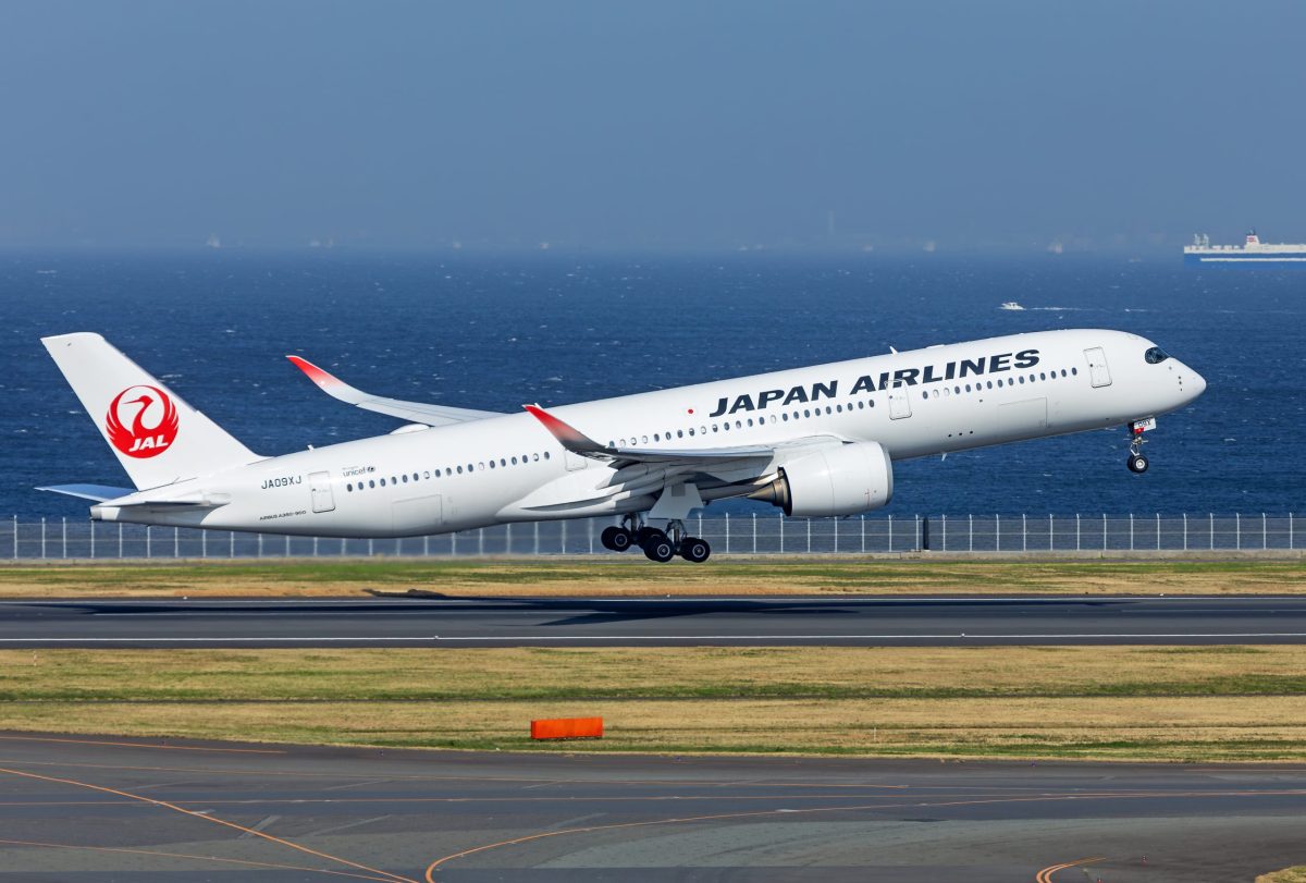
Although Japan Airlines’ distinctive white livery may appear simple on the surface, it is rooted in deep history and tradition.
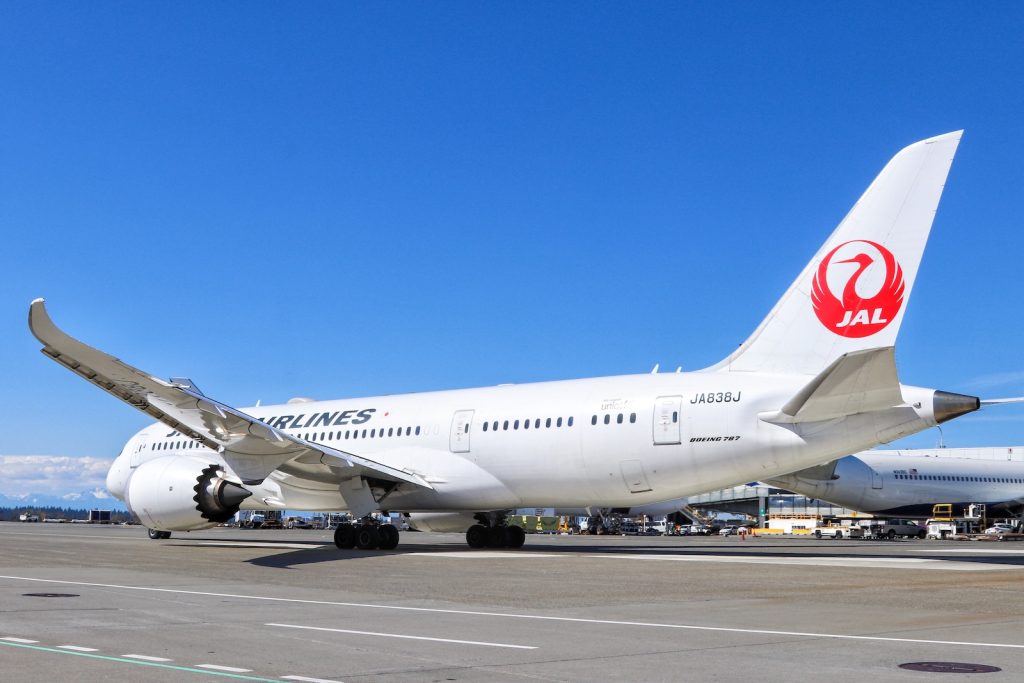
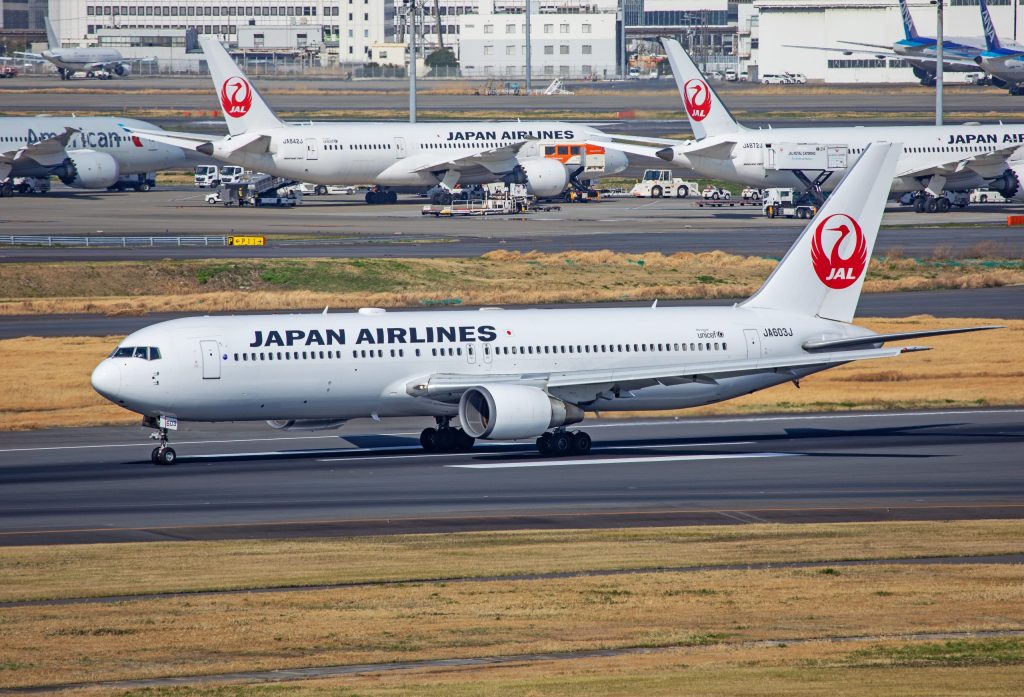
The livery itself is basic: the Japanese flag carrier paints its aircraft in an all-white paint job, with its iconic crane logo on the tail and “Japan Airlines” boldly written along the top front portion of the fuselage.
The crane logo is rich in traditional symbolism. Known as Tsurumaru, the circular crane logo was designed in 1958 by Jerry Huff of Constantine and Gardner, Japan Airlines’ San Francisco-based advertising agency at the time.
“I had faith that it was the perfect symbol for Japan Airlines. I found that the Crane myth was all positive – it mates for life (loyalty), and flies high for miles without tiring (strength),” Huff later wrote about his choice of the crane.
The crane motif – which shows a red crane with its wings spread enclosed within a circle – has been featured on the company’s aircraft liveries for decades. In 2002, Japan Airlines introduced a new “Arc of the Sun” livery that replaced the crane on the tail.
Less than a decade later, however, the carrier brought back the Tsurumaru crane icon with its present-day livery, debuting the new look in 2011. By 2016, the entire fleet had been painted into the livery that exists today.
Looking for a new airplane model? Head over to our friends at the Midwest Model Store for a wide selection of airlines and liveries.
