


For businesses across the world, branding plays a crucial role in public perception and airlines are no different. One of the most prominent pieces of an airline’s brand is its logo, as it often appears on a wide range of items including aircraft, seats, food, advertisements and more. In this multi-part series, we will look into some of the local ties and histories from which some logos are born and how they have grown or evolved over the years.
We conclude our Americas portion of the Logo Lineage series with a trip back down into Central America and the Caribbean, where standing out would cause two airlines to evolve their locally inspired logos into completely different designs while still maintaining local ties.
Aeromexico
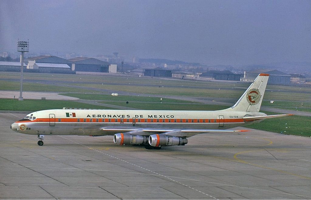
While most airlines want to keep to one logo, there comes a time where creativity in the name of standing out from your competition is key and that is clearly seen in Mexico in the 1950s. Prior to 1950, both major Mexican carriers Aeronaves de México and Mexicana de Aviación shared a similar logo of the eagle, as featured on the country’s seal. Both brands originally avoided using the logo on their aircraft, but as the jet age approached, Aeronaves de México decided to make a change of its logo to create a different brand identity to that of the competition.
The new logo for the later-named Aeroméxico would be the Aztec eagle warrior, alternative called eagle knight, with the entire head of the warrior and the eagle appearing in an orange and tan circle. The new logo was originally very focused on the eagle, showcasing the eagle’s feathers and eyes while the warrior would only receive a nose and mouth with his eyes being shadowed by the headdress. The airline’s name would appear the edge of the new design as part of a circle.
Over time, Eagle Knight has gone through various aesthetic changes as the airline has removed details to his face and headdress and has gone through a change of color scheme in the decades following its release. In the 1970s, the logo would see the detailed designed turned blockier for easier use and application as the airline moved on to meet the times. Altered logos and liveries would also be released in the 1980s, 1990s, and 2000s that would reduce the blocky design as well as change the airline’s color scheme from orange and black to blue and red. While color scheme and small aesthetic changes such as a more curved headdress and color scheme have changed, the overall Eagle Knight design has remained unaltered for over 30 years.

Now, with one of the most recognizable brands in North America, Aeroméxico says that the Eagle Warrior is still their source of strength and courage as it continues to push to be one of the leading brands in Latin America. In recent years, Aeroméxico has taken the leadership role in Mexico as fellow carrier Mexicana fell into bankruptcy in 2010 and left the airline as the largest carrier in the Central American country with new main stage competitors in low-cost carriers Interjet and Volaris gaining traction after the collapse of Mexicana.
British West Indies Airways/Caribbean Airlines
During the 1970s, British West Indies Airways, also known as BWIA, was looking to start the jet age with a logo that would draw out the history of Trinidad and Tobago as it moved to establish a larger international presence from its island. Prior to the addition of a logo, the airline’s fleet had mostly been used in a white and blue scheme that only featured the words ‘BWIA’ down the fuselage and tail. However, with the addition of new jet aircraft and the retirement of the Vickers Viscount, BWIA made a choice to bring forward a new logo for the flag carrier.
The new logo would feature a steel pan with the letters BWIA written down the center of the instrument. The steel pan is a large metal pan used for its musical capabilities and originates in the airline’s homeland. The airline would also change their color scheme with the steel pan appearing in a sea green and mustard yellow color scheme while BWIA would be written in hot pink.

Unfortunately, while the branding made BWIA popular, the carrier was financially compromised. In 2009, the airline would be dissolved to create a new airline called Caribbean Airlines. Many parts of BWIA made the transition to Caribbean, including the idea that the logo should be tied to the home islands. The steel pan and green and yellow livery would be retired and in its place, the hummingbird would take over with new branding highlighted with green, purple and magenta hues.
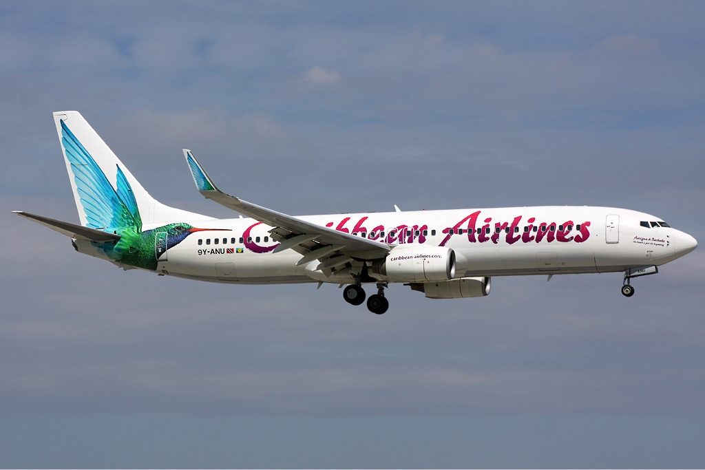
Despite the loss of the steel pan logo, signs of the old BWIA lineage can still be seen with the airline’s inflight magazine’s name, Caribbean Beat, paying homage the well-known Trinidadian and Tobagonian tunes that the island produces. The airline also is a sponsor for a steel pan group in the islands, the Caribbean Airlines Parkside Steel Orchestra, which was agreed upon as part of the airline’s 2019 Caribbean culture themed marketing plan called ‘The Caribbean Identity.’
