

It is hard to keep a secret as big as a 747. Last week, a few pictures were leaked and German carrier Lufthansa had no choice but to go with the flow; its livery redesign was exposed and caused mixed emotions amongst aviation enthusiasts and the general public.
Good morning from the flight deck. Not from any flight deck, but from our pilot @wilco737 in the #B747 in the new Lufthansa livery. #LH9877 #LufthansaBlue #ExploreTheNew pic.twitter.com/O9e08CNeNR
— Lufthansa News (@lufthansaNews) February 3, 2018
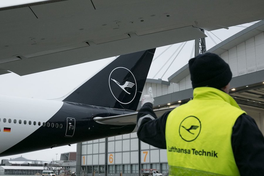
After years of a distinctive yellow that has identified the brand throughout the world, Lufthansa decided to change to a blue and white scheme. Fortunately, the crane logo created by Otto Firle in 1918, will live on, which was originally created for Deutsche Luft-Reederei, the first German airline.
In 1926, Deutsche Luft Hansa adopted the symbol and used until it was dissolved by the Allies in 1951. Two years later, Luftag, (short for “Aktiengesellschaft für Luftverkehrsbedarf”) was founded, and set its headquarters in Cologne. In 1954, Luftag decided to acquire the name, trademark (Firle’s crane) and the brand colors: blue, white, and yellow.

After the initial confusion, more photos and information was released by the company, which rendered the unveiling event that was set to take place this week a bit unsurprising. The Boeing 747-8i that is going to present the livery, D-ABYA, won’t be alone in the task: an Airbus A321 with registration D-AISP will visit Paris and Milan as part of the unveiling tour.

It is quite subjective to analyze Lufthansa’s new livery from a like/don’t like standpoint. Nevertheless, it is a bold move to change such a distinctive brand for a carrier that has an image that is recognized and remembered so easily worldwide. As a PR strategy, it has proven to be a good move: it’s been almost a week and there are still a fair amount of voices — for and against — that will mention Lufthansa.
