


For businesses across the world, branding plays a crucial role in public perception and airlines are no different. One of the most prominent pieces of an airline’s brand is its logo, as it often appears on a wide range of items including aircraft, seats, food, advertisements and more. In this multi-part series, we will look into some of the local ties and histories from which some logos are born and how they have grown or evolved over the years.
When it comes to branding to stand out, the Lufthansa Group has the tough task of maintaining multiple brands that are all very close geographically in Central Europe. While every brand cannot be as simple as Swiss International Airlines’ flag logo, the German parent company of numerous flag carriers has a history of acquiring and maintaining these well-recognized logos.
Lufthansa
As the main and the oldest airline in the Lufthansa Group, we will start with Lufthansa. The airline’s logo is well recognized as a crane with wings spread visiting countries across the world.

The idea of the using the crane as a logo transcends the airline itself with the logo originally being designed by Otto Firle in 1918 for the first airline of Germany, Deutsche Luft-Reederei.
The airline would operate for a mere eight years before it would merge with fellow flag carrier Junkers Luftverkehr to for the first iteration of Deutsche Luft Hansa. The merged brand would operate a fleet of Focke-Wulf, Junker, Heinkel, Boeing and Douglas airframes in black and bare metal liveries with the crane appearing either on the nose or rudder of the aircraft. While the aircraft were black and silver, the airline’s marketing was done using blue and yellow.
The original Deutsche Luft Hansa would not last as the airline would only operate until 1945 when flights were suspended as the Second World War was approaching its conclusion. Due to Germany losing the war and Deutsche Luft Hansa having government ties, the Allies would seize the aircraft and dissolve the airline after the war.
A decade after the war, the name Lufthansa would return to the skies over Weste Germany as a new version of the government-backed carrier would start operations between Germany cities in April 1955. It would take Lufthansa less than two months before flights outside the country would commence.
As a result of the crane’s ties to Central Europe and their symbolism of strength, the newly-formed carrier would keep the old crane logo and apply it to the tails of its aircraft. The airline would also keep the name Lufthansa and the blue and yellow color schemes. The original scheme would last till the 1965 but return for a 50th-anniversary heritage livery on an Airbus A321 between 2005 and 2014.
The new livery would see a blue cheatline with a silver belly and white upper fuselage. The airline’s name would run the length of the fuselage in capital letters and the tail would have the logo in a yellow semicircle with the area in front of the circle being another blue stripe.
The redesigned livery of 1965 would see the only structural change to the Lufthansa crane with the addition of a circle around the bird being added. The new livery would keep the grey belly, white upper fuselage and blue cheatline but make massive changes to the tail with the new tail being solid navy with a yellow circle and navy crane. The name Lufthansa would also be shrunk and moved to just take up space on the forward fuselage. This iteration of the Lufthansa livery as also remade a return in recent years with a Boeing 747-8 being delivered in 2015 in the paint scheme.
A modified livery would make its debut in 1989 with the tail remaining unchanged but the fuselage seeing the blue cheatline being dropped in favor of a white-dominated fuselage, dubbed “Eurowhite” with cool grey underbelly. Despite the livery change, the branding and marketing would change very little as the airline would use yellow as the dominant color with the wording the logo appearing in navy.

But that would change in Feb 2018 when Lufthansa radically shifted its color scheme. The airline would drop the yellow from its dominant state as navy and white would take the lead. The new livery would see an all-white fuselage with a navy tail where the crane would be colored in white with a navy background. The only remaining usage of yellow would appear in specific marketing and backgrounds as well as on the aircraft as part of the “Welcome” sign on the boarding door.

During the livery reveal, the airline noted that “An important challenge in revising the design was to meet the requirements of today’s and tomorrow’s digital world. In addition to optimizing the crane for new technical requirements, Lufthansa has developed its own typeface, which is particularly easy to read on mobile devices or smartwatches.”
The airline has also given back to the bird that has helped establish itself as a global icon by helping protect the grus grus crane avoid extinction in the 1990s. The airline worked alongside the Naturschutzbund Deutschland e.V. and WWF Germany to form the Kranichschutz Deutschland, which has helped the migrating bird to recover to its current state that the International Union for Conservation of Nature marks as “Least Concern.”
Austrian Airlines
Coming just two years after the start of the second iteration of Lufthansa, Austrian Airlines would make the home country’s flag a vital part of its livery and continued that tradition and continues to pull these values into the airline today. The main colors of the Austrian flag, red and white, are seen in every version of their paint scheme and marketing.
The airline’s first logo, however, looked far from the one that the airline uses today. The airline started by using a bird, which would appear on the forward fuselage below the cockpit windows and would have two horizontal red lines paralleling themselves down the fuselage of the plane. The red lines would separate a grey belly and white upper fuselage.
For the airline’s first livery, the design would stick but as the 1970s started, the airline was looking for a new logo as the jet age firmly descended on Austrian. As a result, the 1971 branding would simplify the livery and overhaul the airline’s logo and branding direction. A new logo, the Austrian chevron, would debut on the forward fuselage and marketing for the jet. The chevron was easier to use alongside the airline name and would appear in everything from advertisements to airport signage.
As for the aircraft livery, the airline would only change the fuselage of the jet with the tail remaining in its same red-white-red pattern. On the fuselage, the white top and grey undercarriage would remain but the red stripes would be removed. The airline’s new logo would appear on the forward behind the forward boarding door with the Austrian name being capitalized on the windows above and behind the design.
A simple livery change would be made in the 1980s with the airline reducing the use of grey in the fuselage, The new livery would see the grey recede from below the windows to just the underbelly of the aircraft. This aircraft’s livery would disappear in the 1990s but has since returned with Austrian replacing the previously mentioned retrojet with one that wears the 1980s colors, which is an Airbus A320 with registration OE-LBO.
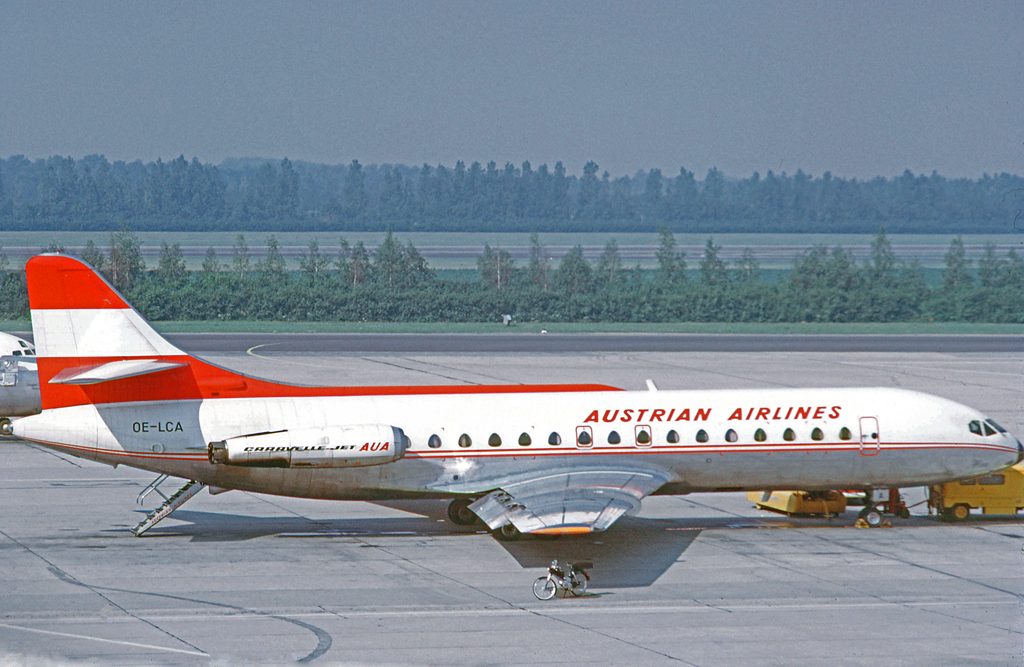
The 1990s would present another livery change and would finally alter the tail from the now 30-year consist scheme. In the new livery, the airline would keep the two-color three-bar design but would include the airline’s chevron in the center. The chevron on the forward fuselage would stay but be reduced to appearing just above the windows.
Blue would make its first appearance on the livery with a navy stripe running down the fuselage under the windows. Other changes to the livery would see “Austrian” written in black instead of red and the grey underbelly would vanish. Branding for the airline would change slightly, with the navy stripe now appearing under the airline name and chevron when appearing on advertisements and timetables.
A new decade would mean another new livery for Austrian as 2003 saw the chevron go through a radical shift to meet the new century. The old 2D logo would be shifted into a 3D look by using a mix of color changes and a drop shadow the make the logo appear to be flying. While the overall design of the livery would be similar to previous logos, small changes would be made including re-enlarging the forward fuselage logo, returning the lettering to red, and curving the horizontal bars on the tail to curve around the new chevron.
However, there were some larger changes that were made to both the airline’s livery and corporate structure. In the livery, the navy stripe would be removed as a sky blue underbelly and engine covers would be chosen for the airline instead.
And on the corporate side, the airline would add regional alliance with fellow Austrian carrier Tyrolean, who would carry the regional brand name Austrian Arrow, paying homage to the flag carrier’s logo of the chevron. The Lufthansa Group would also take its stake in Austrian in the years following this livery, with the airline now owning a majority stake in the neighboring airline. Austrian Arrows would dissolve in 2012 and Tyrolean and Austrian would start a merger that would be completed in 2015.

Much like every other decade before, Austrian would use the mid-2010s to start another rebranding this time centered starting with its myAustrian Holidays subsidiary. In the new livery, Austrian would remove the sky blue from the livery in favor of an all-white fuselage and red and white engine covers. The airline’s tail would remain unchanged but the name on the fuselage would appear to say ‘myAustrian’ with the ‘my’ written in black and ‘Austrian’ remaining unchanged from the last livery. This livery would last a year before the ‘my’ and the chevron’s drop shadow disappearing in 2016.

Still unsatisfied with the new livery, Austrian went through another livery change in 2018 citing the demand for meeting the digital today. For the first time in the airline’s history, the chevron would not appear on the fuselage with the airline opting for billboard Austrian titles instead. The red engines would be removed for solid white ones and the red on the tail would extend onto the rear fuselage. The airline hopes that these changes will allow a more controlled and charming use of the airline’s logo and expects the entire fleet to receive the new livery by 2025.

Brussels Airways
Dating back to 2002, the presently known Brussels Airlines would have to build itself from the ashes of the recently collapsed Sabena Airlines. SN Brussels Airlines had a history with the previous flag carrier as a regional carrier for Sabena since 1986 under the name Delta Air Transport (DAT). As DAT, the airline livery would consist of a blue cheatline separating two a white and light grey fuselage. The airline’s tail would be blue with a white circle holding the airline’s own logo, a blue triangle with a curved bottom.
Sabena would eventually have DAT focus more on uniform branding with its previous agreement with KLM Royal Dutch Airlines being removed as DAT aircraft would receive the Sabena “S” on aircraft. The use of the Sabena logo would continue even after the airline collapsed in 2001.
After the collapse, a move to reestablish Belgian flights saw Delta Air Transport spun off to become SN Brussels Airlines and restart operations using some of Sabena’s old fleet. The airline would retain the Sabena logo and tail but modify the fuselage add a cool grey belly and white top separated by a very narrow orange cheatline. SN Brussels Airlines’ logo would mirror the new livery, with an orange line appearing below the airline name and logo.
After agreeing to merge with main competitor Virgin Express in 2006, the now-named Brussels Airlines would overhaul its image and finally close the book on the Sabena ties to the new flag carrier. The airline would contract out Hoet & Hoet to create a new logo for the airline. The Belgian marketing team would create a 13-dot design that would stand for the airline’s number of destinations outside of Europe. The dots would form the edge lights of a runway and the shape of a ‘b’.

The ‘b’ marketing direction would take off with Brussels Airlines with special deals like “b.group,” “b.student,” and “b.family” being marketed to travelers with the airline’s callsign being “Beeline.” But not everything was perfect for the airline as Hoet & Hoet would alter the logo in 2007 to add an additional ball after travelers in North America and Europe were worried about conspiracy theories ties to the number 13.
During this rebranding, the airline would receive its current livery featuring the ball design appearing in orange on a navy tail. The airline’s fuselage would keep the white and cool grey, but the orange cheatline would be removed.
One year after the addition of the extra dot Brussels Airlines would start its integration into the Lufthansa Group with the airline buying a minority stake of 45 percent in the airline. By 2017, the Lufthansa Group would own 100 percent of the airline and would start a review into the airline’s branding to see if anything could be done to improve the debt-ridden carrier. Though, currently, no changes have been made to Brussels Airlines’ logo or color scheme.
